ROLE: Logo and book design | CLIENT: The Lab Press
One of five titles that I designed the logo, book and slipcase for with The Lab Press. Each book is a high-end hard back edition with slipcase and spot foil finishes. For each title I also created icons which feature as recurring motifs throughout the interior pages.
To complete the package and create an immersive reading experience from cover to cover, I created background patterns that suit the storyline and chose appropriate fonts. To ensure that each of the The Lab Press's titles—although different in genre and subject—are clearly part of the same line of books, they have consistent layouts and design structures, uniquely styled to reflect the tone of the storyline.
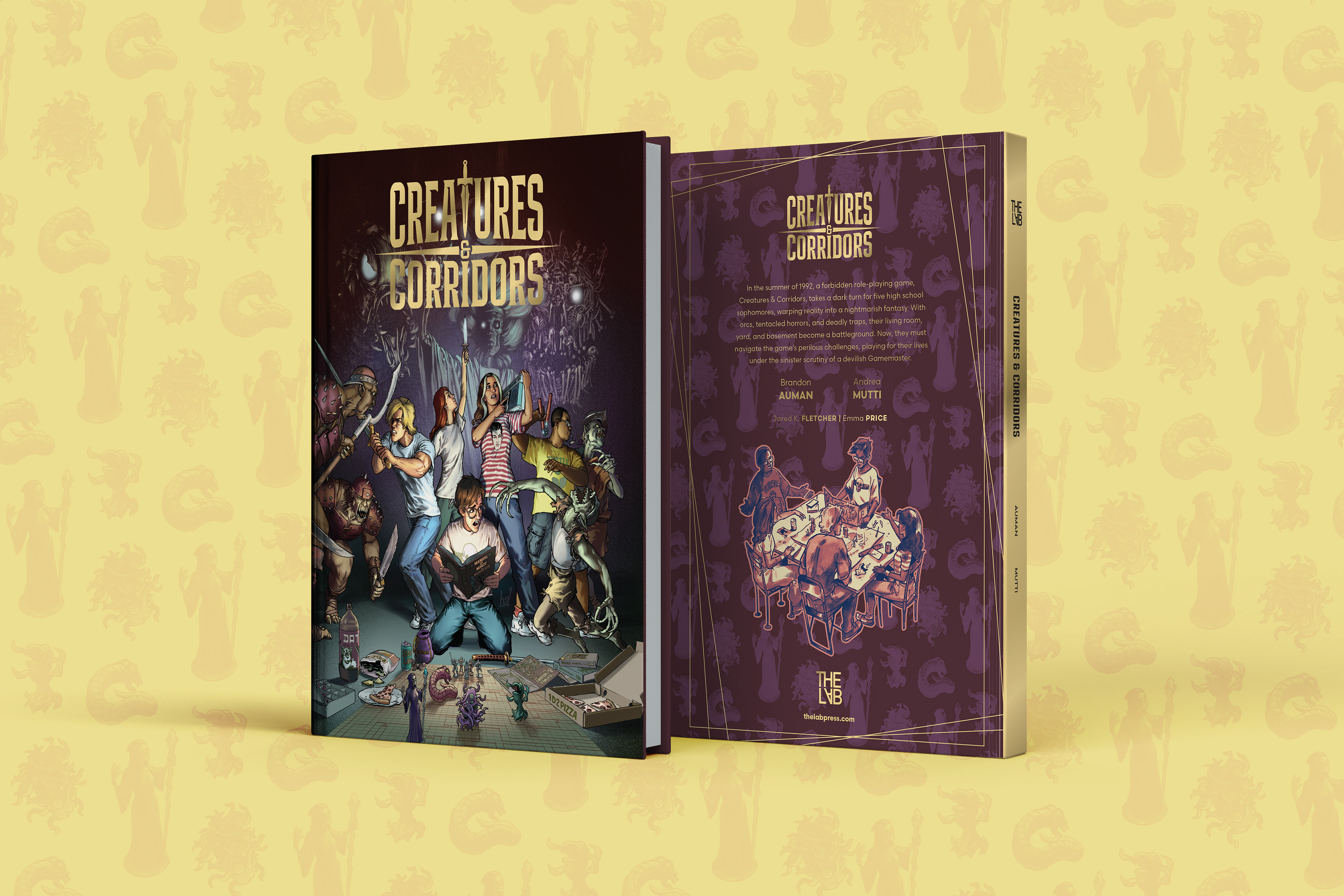
The hardback book front and back cover, showing the spot foil elements and pattern design
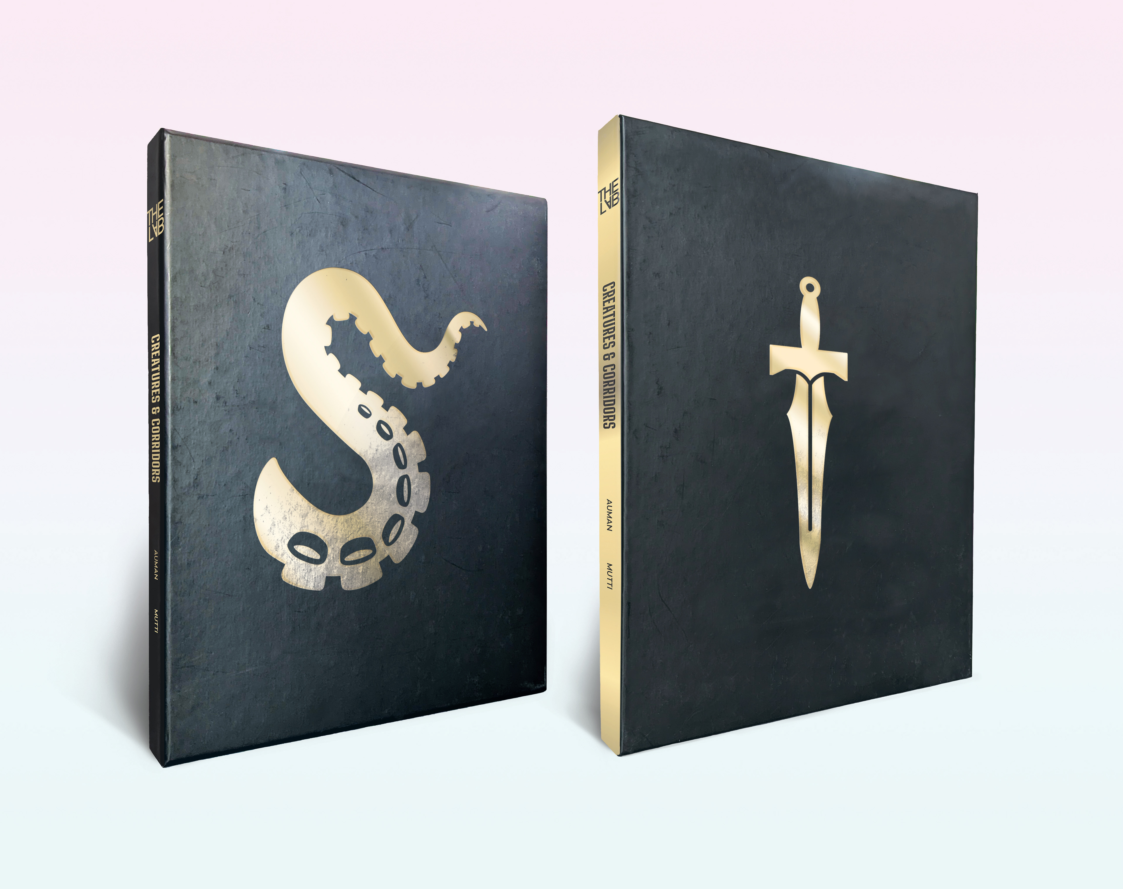
The slipcase with foil elements, including the symbols I designed that are used throughout the interior design pages of the book
LOGO DEVELOPMENT
The book has a number of thematic elements that speak to the Dungeons & Dragons brand, so we wanted to avoid riffing off that, whilst also leaning into the fantasy side of the story. I explored a number of font styles and elements that hinted at the creatures found in the book, but ultimately we all really liked the balance that the sword "T" gave to the final logo choice.
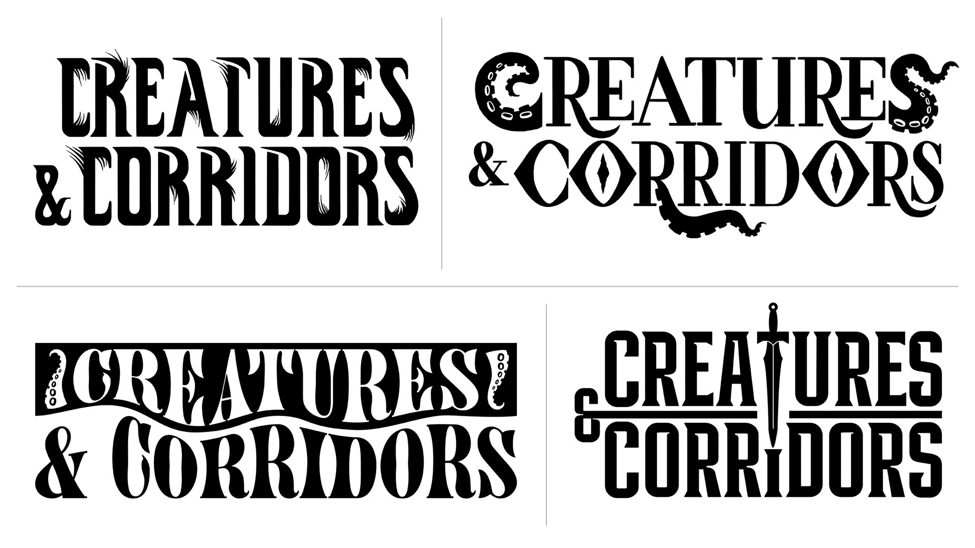
Early logo concepts