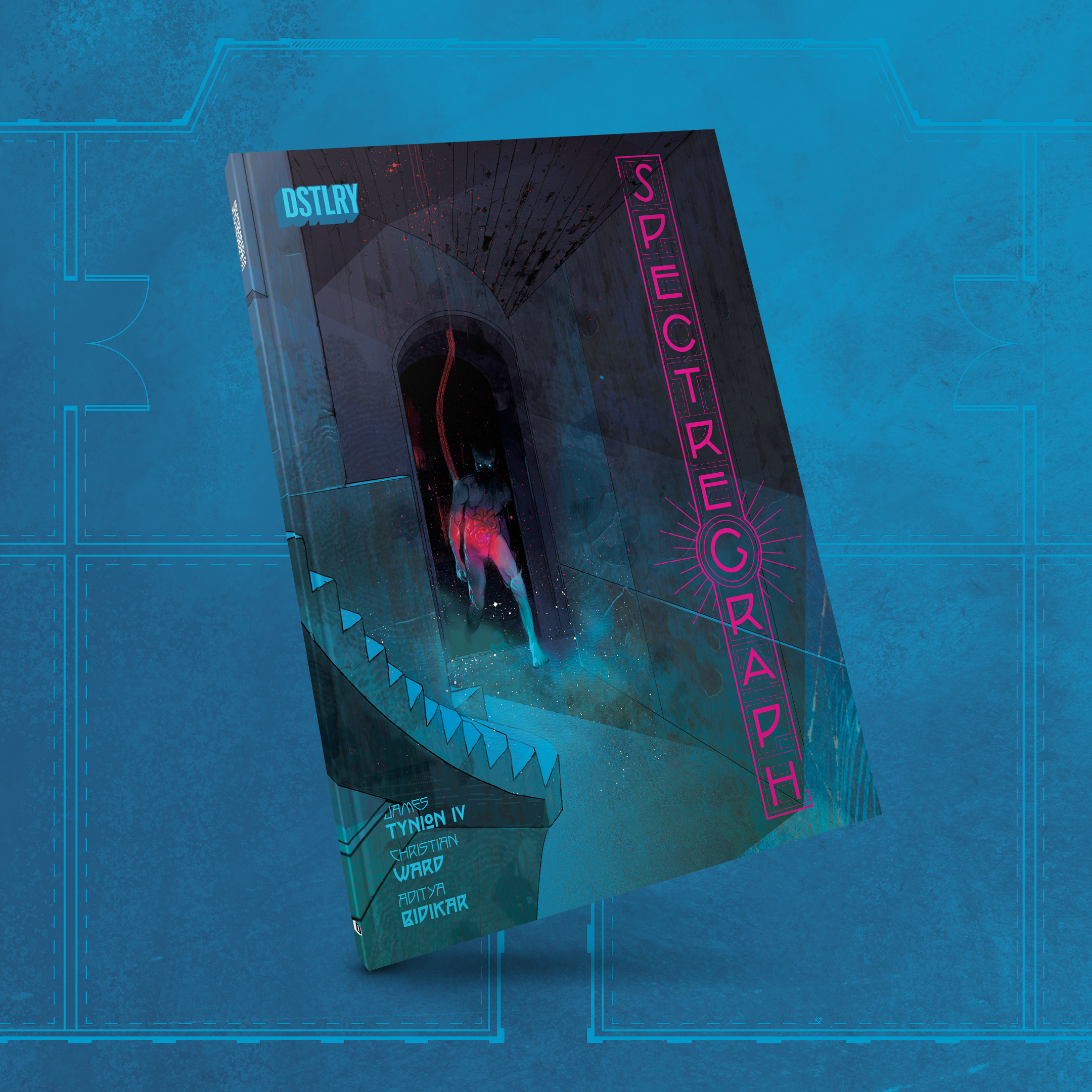
ROLE: Logo and book design | CLIENT: DSTLRY
Titles include inaugural anthology, THE DEVIL'S CUT and spooky festive anthology THROUGH THE BOUGHS: A YULETIDE OFFERING
For more of my work for other DSTLRY titles see below:
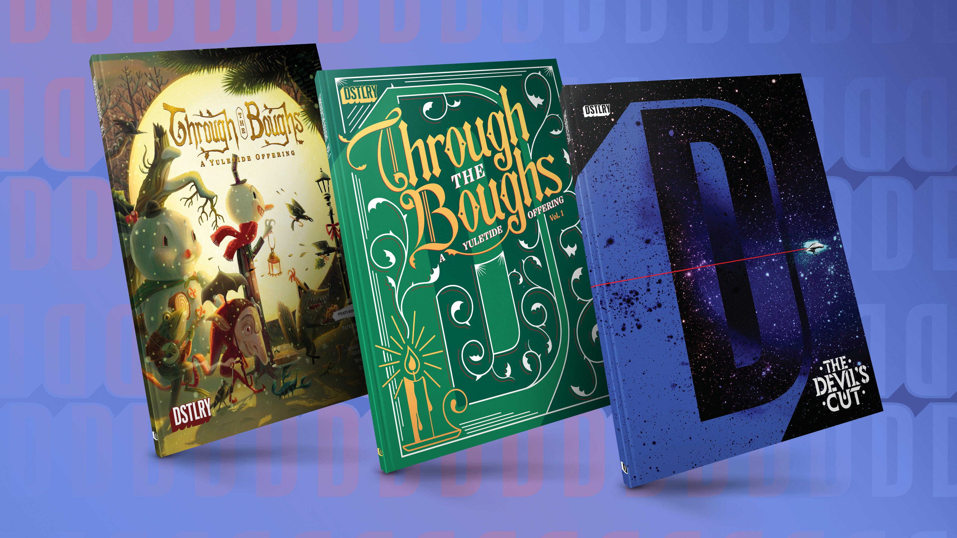
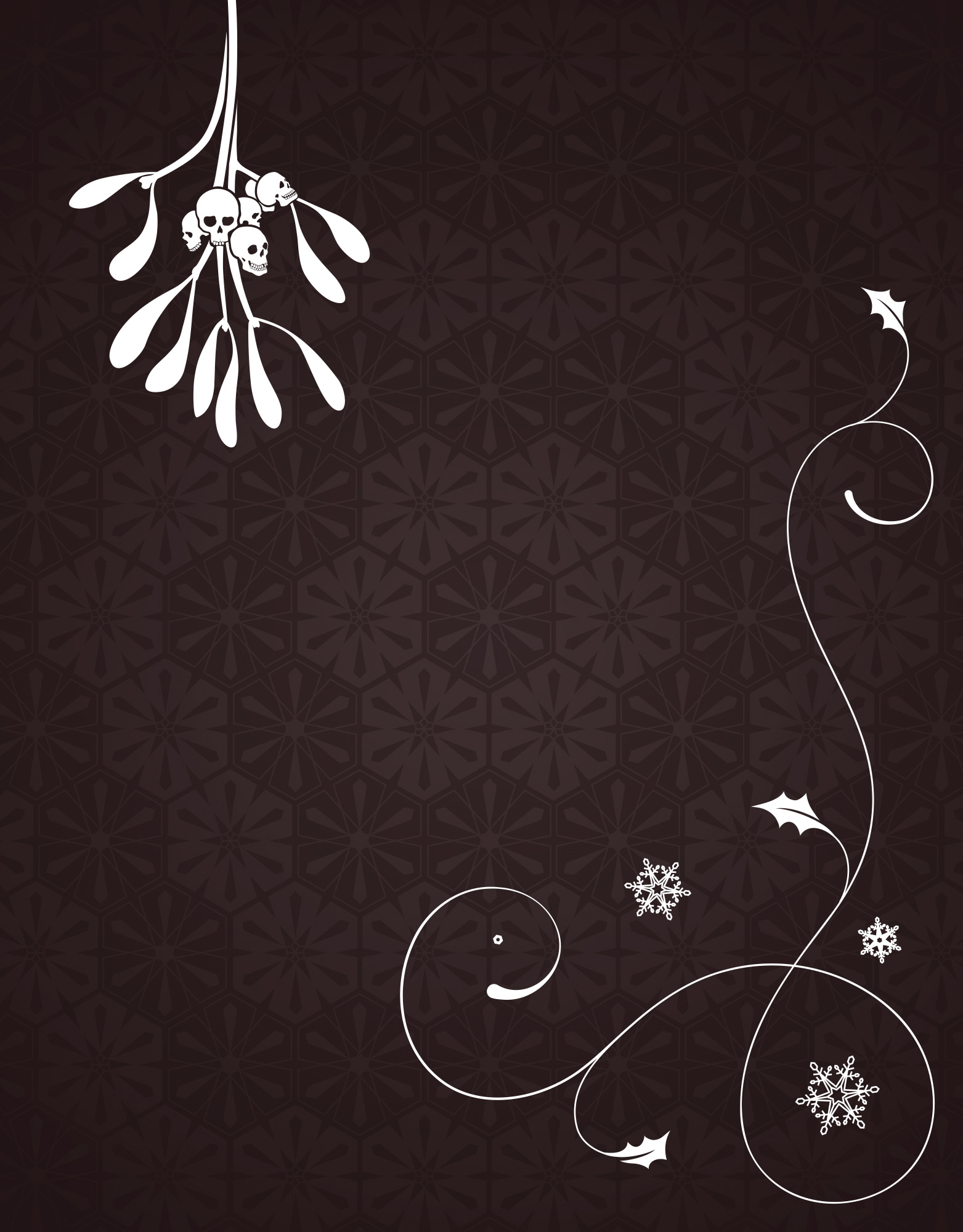
THROUGH THE BOUGHS: A YULETIDE OFFERING
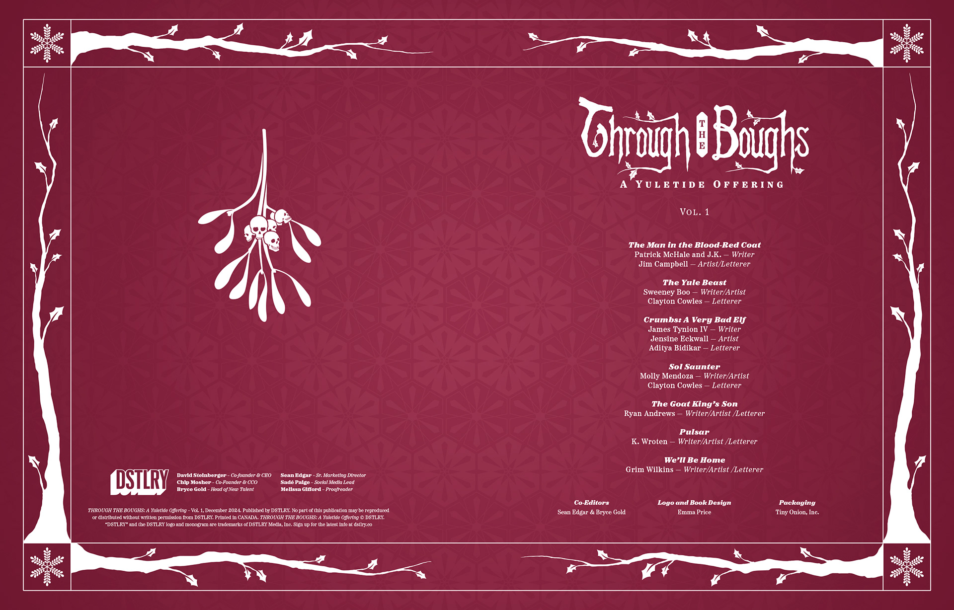
Editors: Bryce Gold and Sean Edgar
Logo and book design for the anthology.
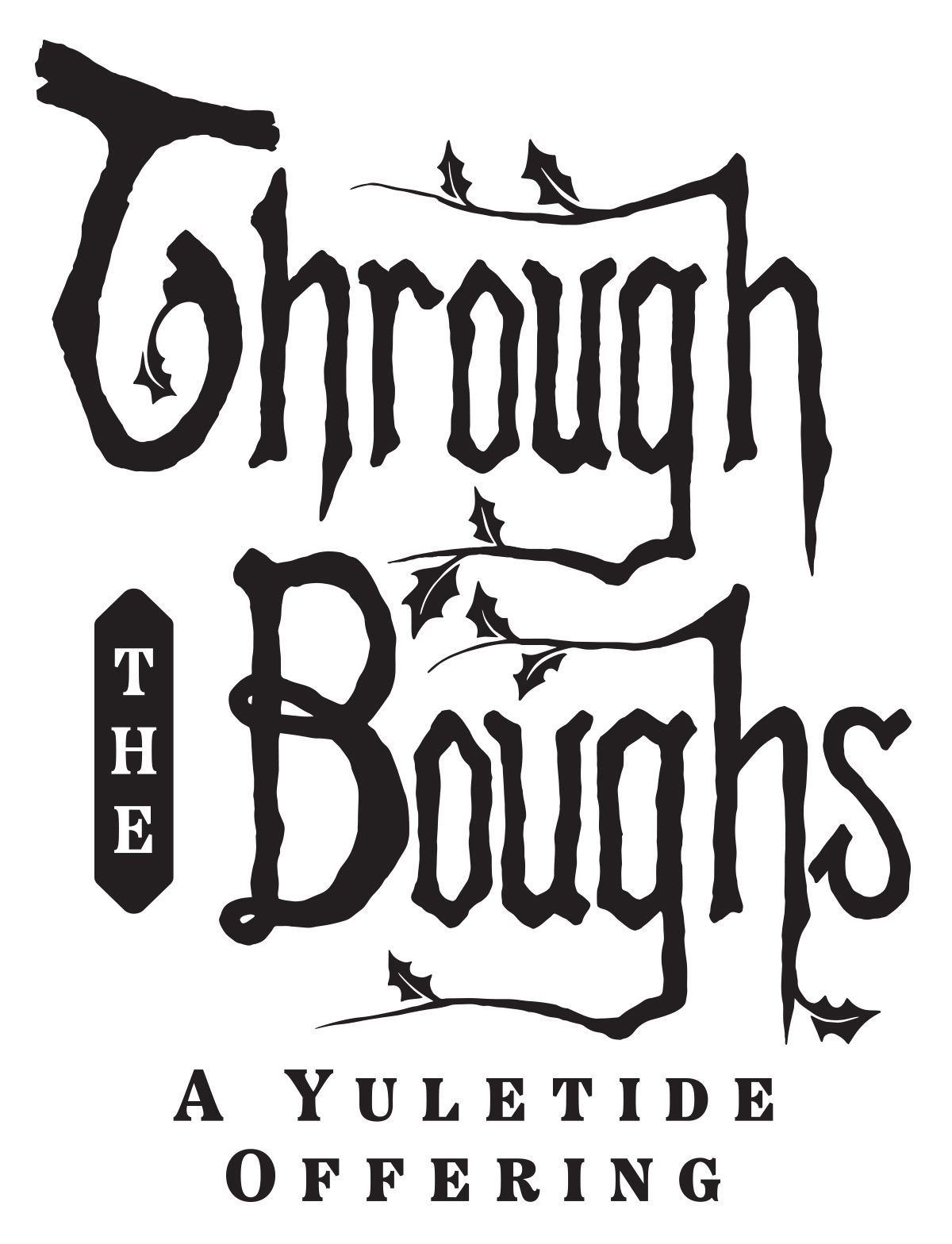
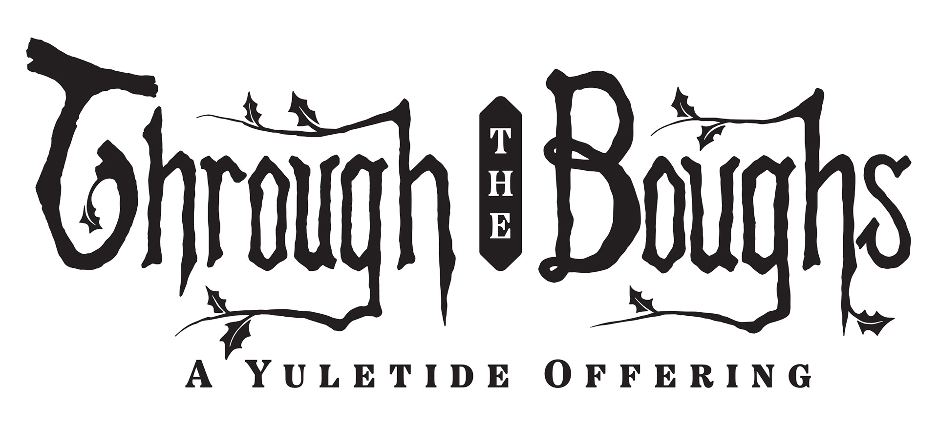
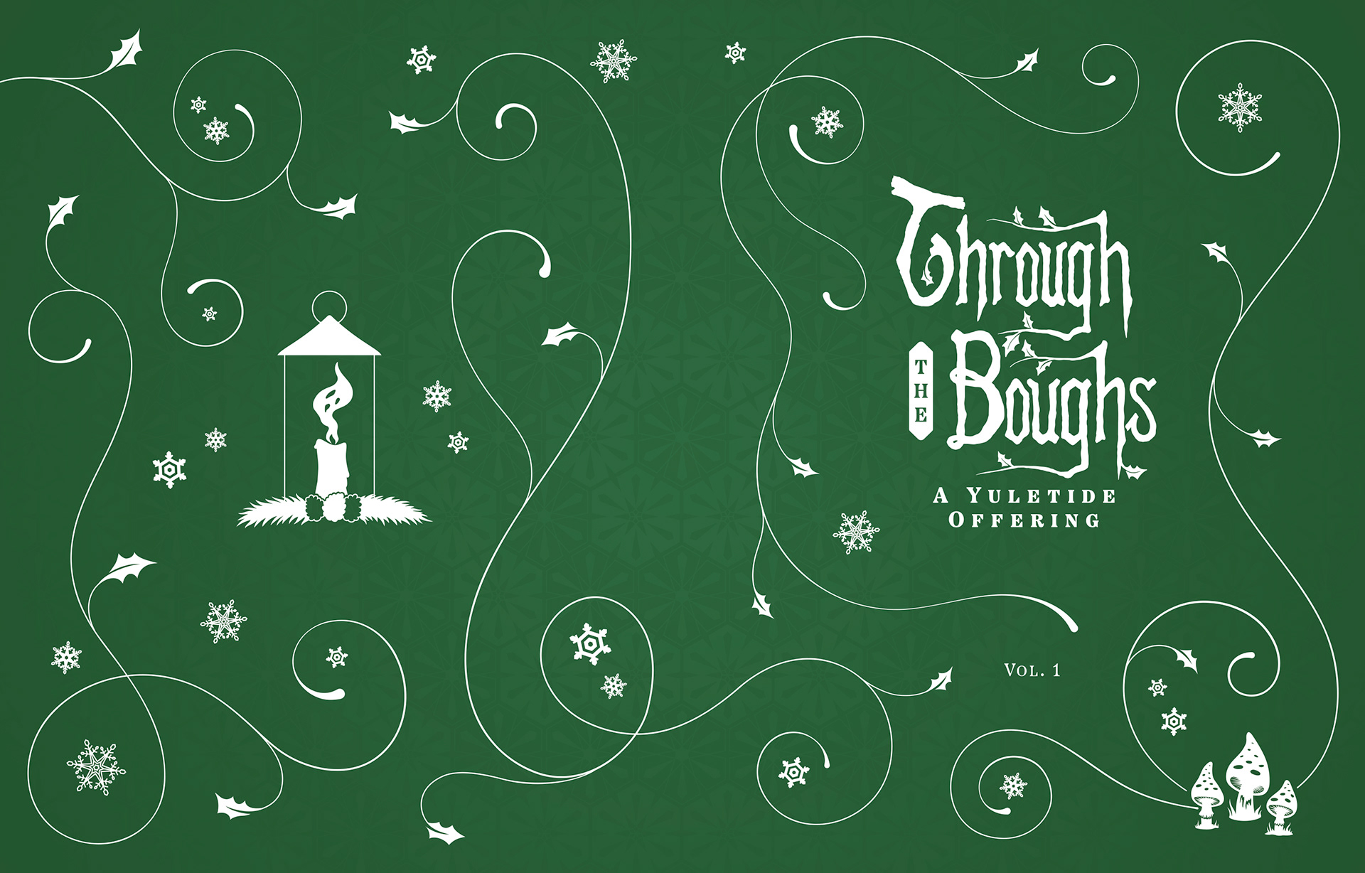
For the logo I looked at a number of different styles, trying to capture the creepy but whimsical aesthetic of the comic strips featured inside. The team really liked two of the options, so they asked me to finalise one for the anthology, to be used across the main cover and most of the variants, and also asked me to adapt a second route into a cover design, which I developed into a complete illustrated wrap, again being inspired by Victorian illuminated, leather-bound books.
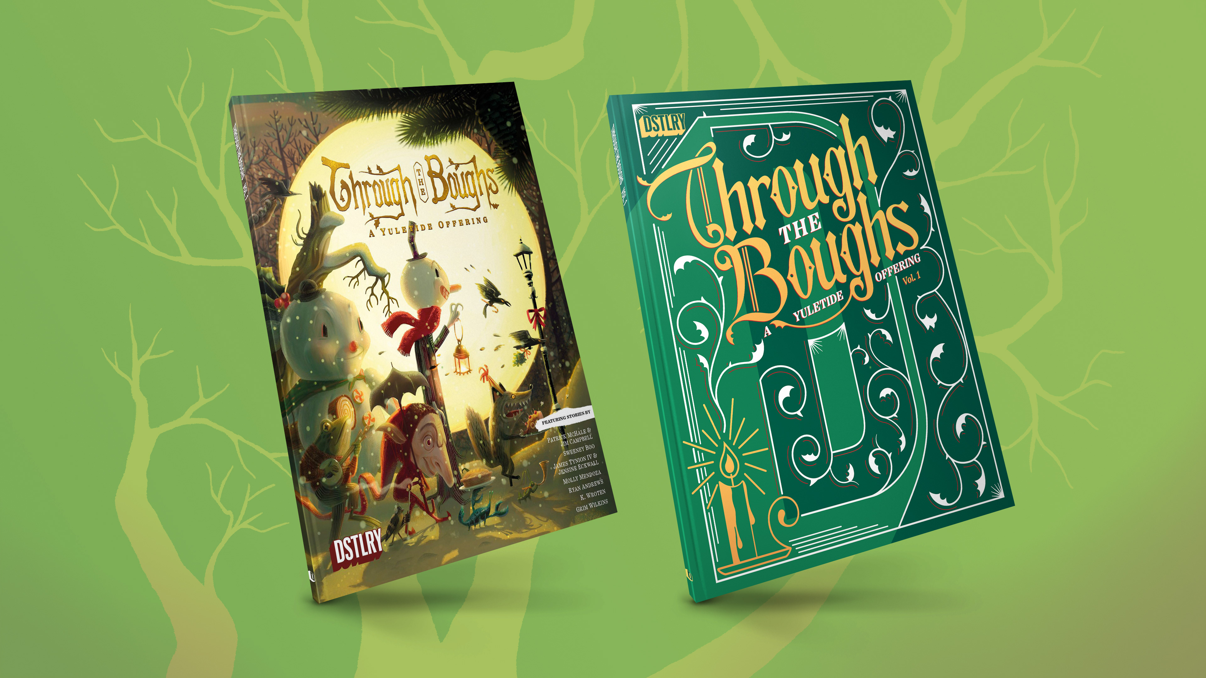
Left: Main cover with my logo over artwork by Jenn Ely | Right: Variant cover by me, including the alternative logo design
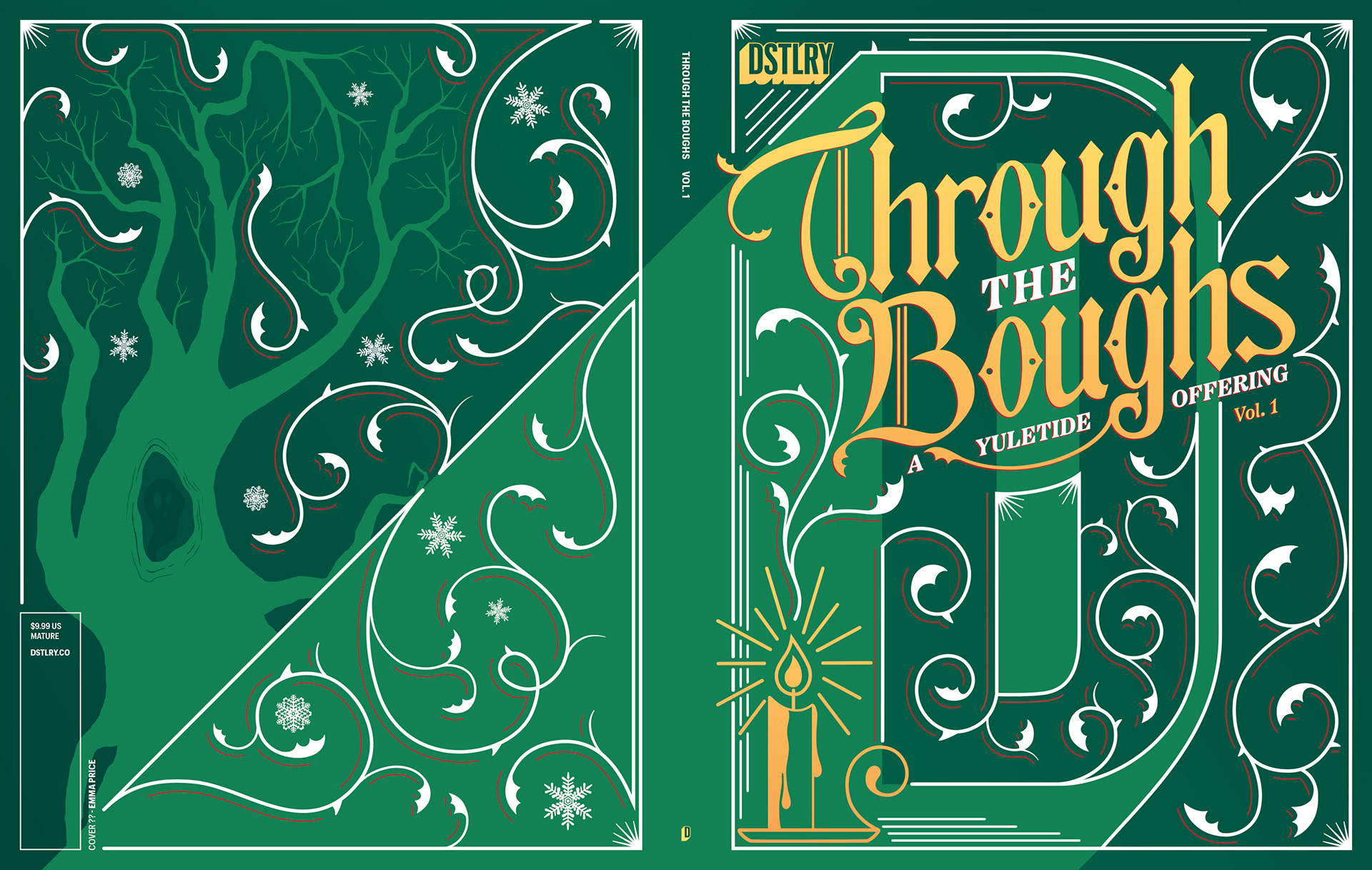
My complete cover wrap design with the alternative logo
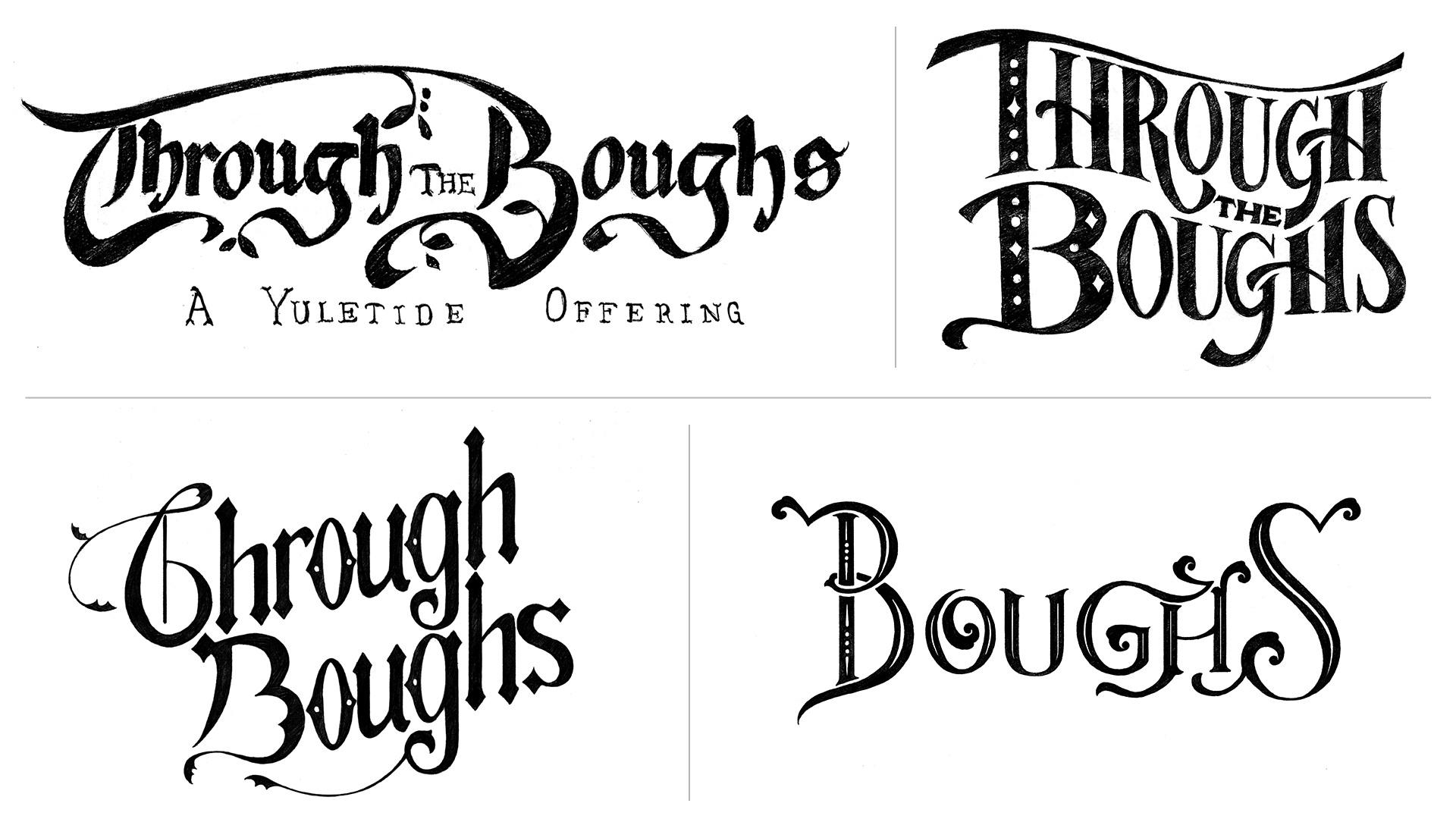
LOGO DEVELOPMENT
I sketched out several options of the logo for the team to look over and we chose a final route (below) that could work as both horizontal and stacked versions.
For the final logo I drew branch-like elements with wintry holly leaves, which I adapted into a pattern to use throughout the book as stylistic embellishments.
INTERIOR DESIGN
For the interior design pages of the book I created an simplified, recurring snowflake pattern to add some texture to the backgrounds, and illustrated some additional graphics to fit with the spooky festive theme.
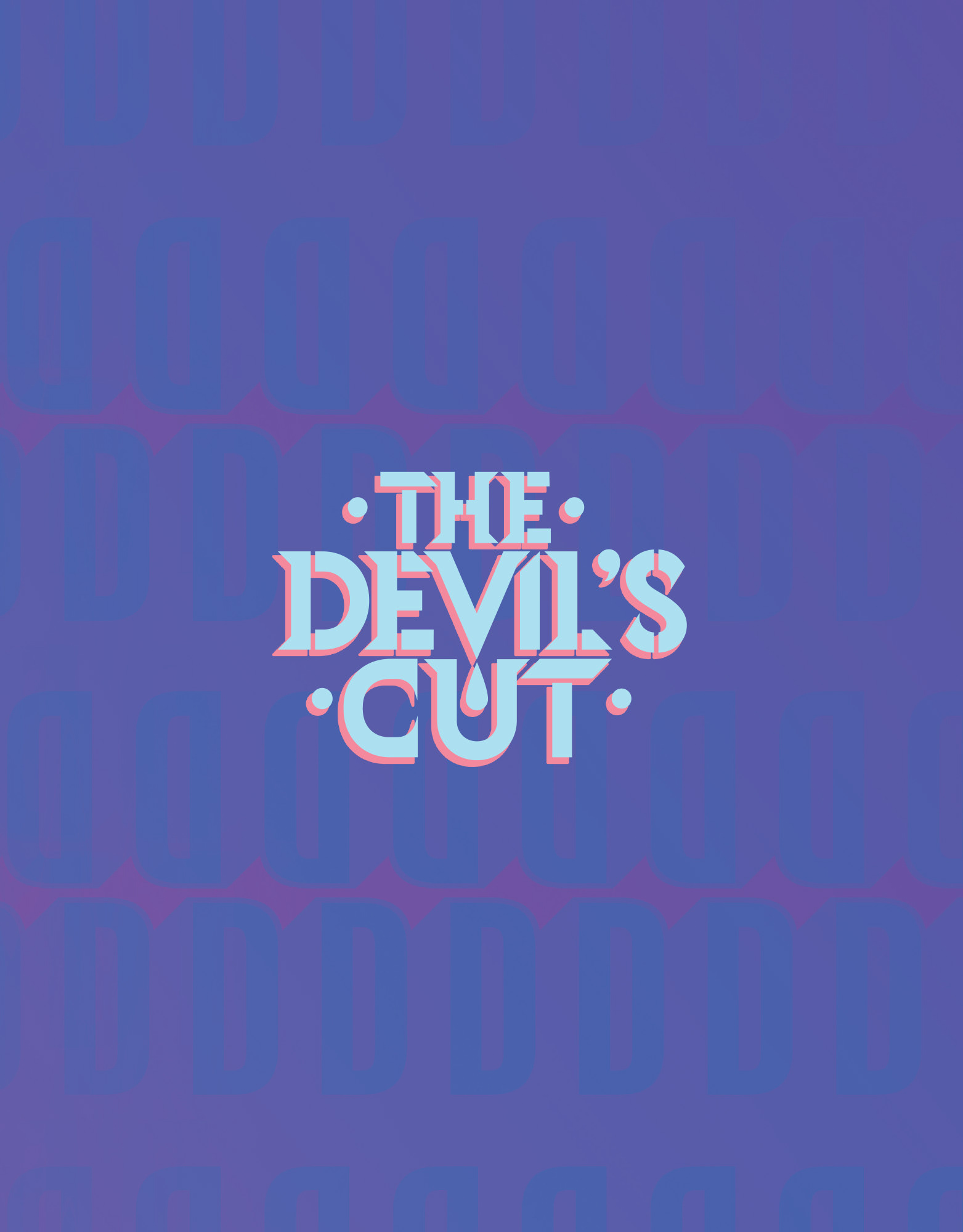
THE DEVIL'S CUT
Editors: Will Dennis and Greg Lockard
Logo and book design for the inaugural anthology that launched the publisher's titles and introduced readers to sneak previews of the stories from their line-up of incredible talent
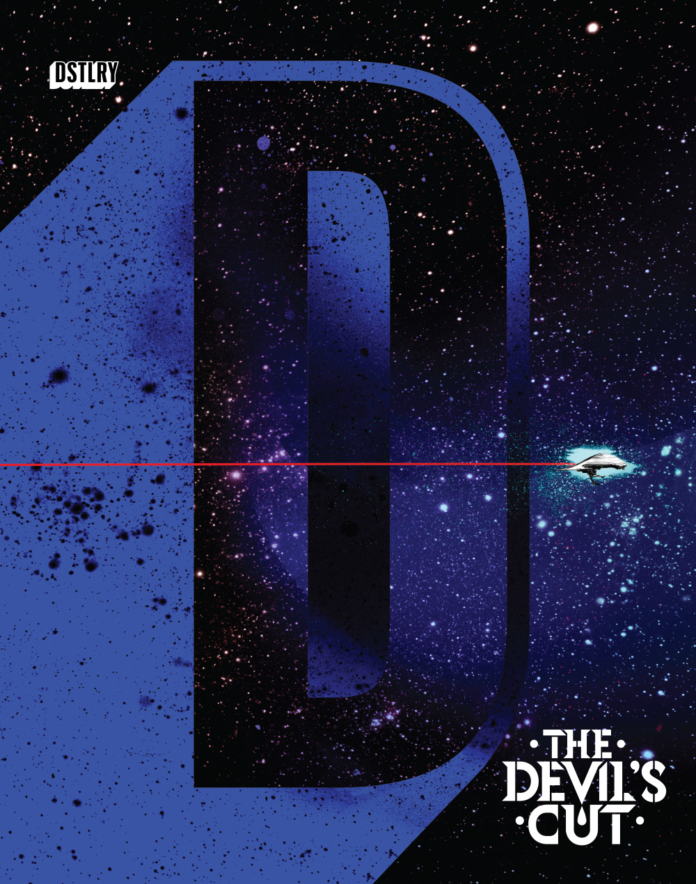
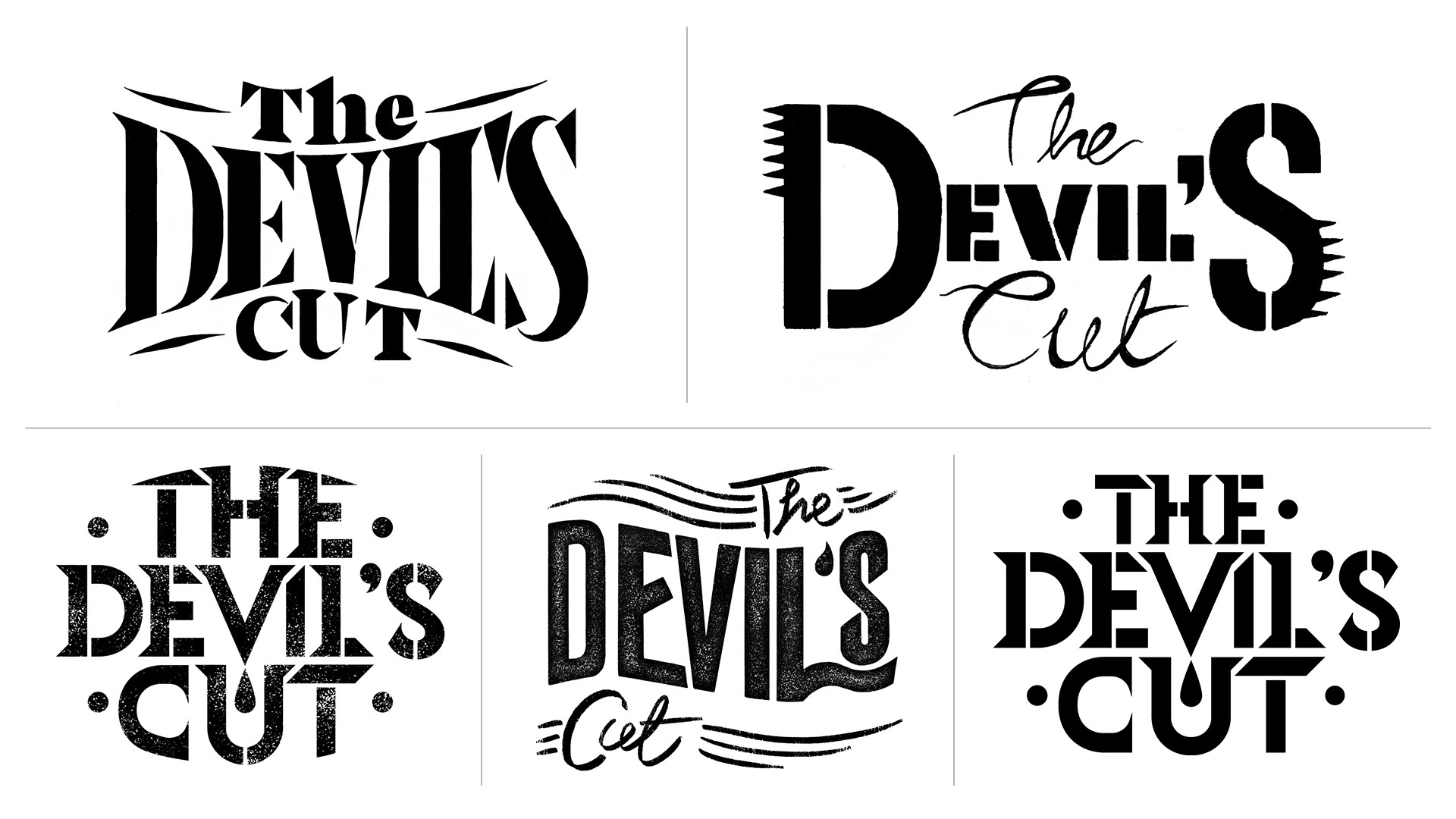
LOGO DEVELOPMENT
"The Devil's Cut" alludes to the most potent spirits that seep into the barrel during the process of whiskey making. We wanted to capture that branded whiskey barrel aesthetic, without losing any of the edginess of the cutting-edge stories being told. I went with some sharply pointed stencil-like letters, with a little drip of something special falling from the 'v'.